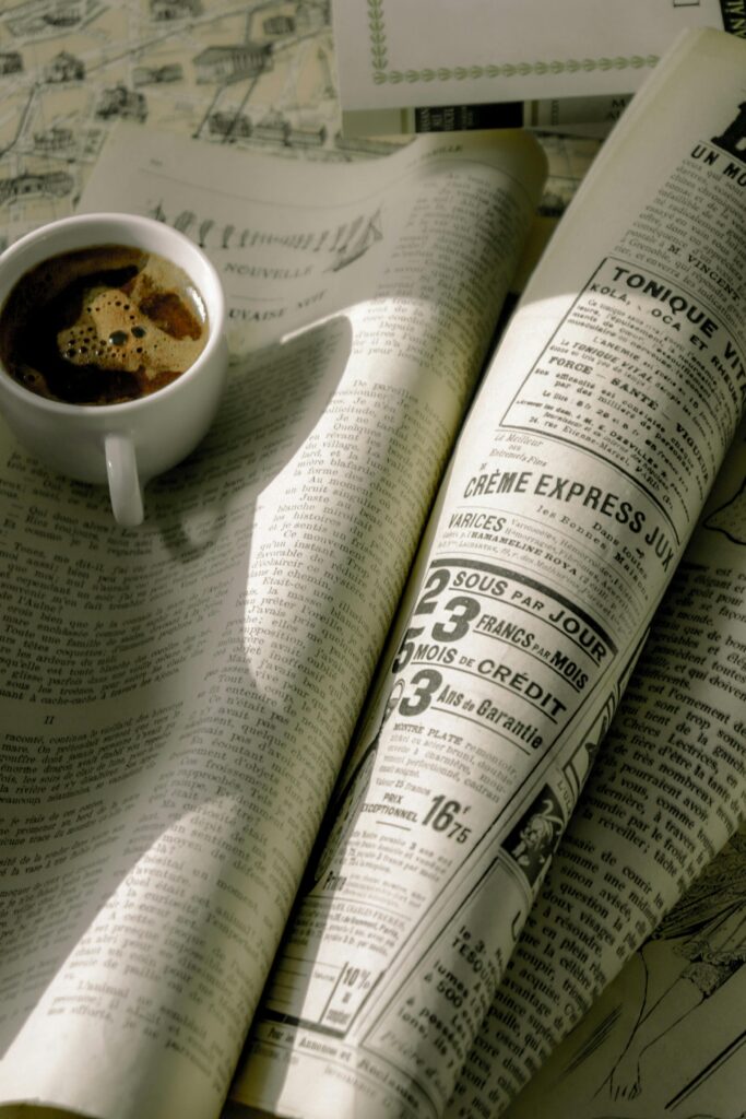
Picking out fonts for your design is like choosing your life partner. Okay maybe we’re exaggerating! However you font pairing are what can make or break your design, even brand. Here are some typography trends and examples of how they can enhance a brand:

- Custom Fonts: Brands are increasingly using custom-designed fonts to create a unique and recognizable identity. These fonts are tailored to reflect the brand’s personality and values, helping to differentiate it from competitors. For example, Google’s custom font “Product Sans” reinforces its clean and modern aesthetic across its products and platforms.
- Bold and Playful Serif Fonts: Bold serif fonts can convey a sense of authority and sophistication while adding a touch of personality. Brands like Vogue use elegant serif fonts in their logos and editorial content to evoke luxury and style.
- Minimalist Sans-Serif Fonts: Clean and minimalist sans-serif fonts are popular choices for brands aiming for a contemporary and streamlined look. Companies like Apple use sans-serif fonts such as “San Francisco” to convey simplicity, clarity, and modernity in their branding and user interfaces.
- Handwritten and Script Fonts: Handwritten and script fonts add a human touch and convey warmth, creativity, and personalization. Brands like Coca-Cola use script fonts in their logo to evoke a sense of nostalgia and tradition while maintaining a friendly and approachable image.

- Variable Fonts: Variable fonts allow for dynamic typography by adjusting attributes such as weight, width, and slant within a single font file. This flexibility enables brands to create responsive and adaptable designs while maintaining visual consistency across different devices and screen sizes.
- Geometric Fonts: Geometric fonts feature clean lines and geometric shapes, lending a contemporary and avant-garde feel to branding. Brands like Airbnb use geometric fonts in their logo and marketing materials to convey innovation, sophistication, and a forward-thinking attitude.
- Contrast and Pairing: Contrast in typography, such as combining bold and light weights or pairing serif and sans-serif fonts, can create visual interest and hierarchy in branding materials. For example, Spotify combines a bold sans-serif font for its logo with a lighter sans-serif font for supplementary text, creating a balanced and harmonious typographic system.
- Responsive Typography: With the increasing prevalence of responsive web design, brands are paying more attention to typography that scales gracefully across different devices and screen sizes. Flexible typography systems ensure readability and consistency while adapting to varying viewing conditions.
By carefully selecting and integrating typography into their branding, companies can effectively communicate their values, personality, and identity to their target audience, ultimately strengthening brand recognition and engagement.
Don’t know where to start when it comes to testing out font pairing? Here are some effective ways to test font pairing:
- Typography Tools and Websites: Several online tools and websites allow you to experiment with font pairing combinations quickly. These tools often provide pre-selected font pairings, allowing you to visualize how different fonts work together. Examples include Google Fonts, Font Pair, Typ.io, and Fontjoy.
- Style Guides and Inspirational Resources: Explore typography style guides and inspirational resources to discover font pairing examples used by designers and brands. Websites like Behance, Dribbble, and Pinterest showcase a wide range of design projects where font pairing is creatively implemented. Analyzing these examples can provide insights into effective font combinations and design trends.
- Mockups and Prototypes: Create mockups or prototypes of your design project using design software like Adobe XD, Figma, or Sketch. Experiment with different font pairings within your layout to see how they interact with other design elements, such as images, colors, and text hierarchy. Prototyping tools allow you to preview your design in a realistic context, helping you assess readability and visual appeal.
- Printed Samples: Print out samples of your design project using various font pairings and examine them in physical form. Seeing how fonts look on paper can provide a different perspective compared to viewing them on a screen. Pay attention to factors such as legibility, spacing, and overall aesthetic when evaluating printed samples.
- User Testing: Conduct user testing sessions to gather feedback on font pairing choices from your target audience. Present participants with different design variations and ask for their preferences, impressions, and suggestions. User feedback can help you identify which font pairings resonate best with your audience and align with your project objectives.
- Comparison Charts and Grids: Create comparison charts or grids to systematically evaluate different font pairing combinations. Organize fonts side by side and assess factors such as contrast, similarity, mood, and readability. Use this visual aid to compare and contrast various pairings systematically.
- Iterative Design Process: Embrace an iterative design process where you continuously refine and iterate on font pairings based on feedback and experimentation. Start with a few initial pairings, gather feedback, make adjustments, and iterate until you find the optimal combination that meets your design goals and client requirements.
By testing out these methods, you can effectively make font pairing combinations and then make decisions to achieve visually appealing and cohesive designs for your brand or design!
